
TL;DR: Responsive website design Toronto means your website works properly on phones, tablets, and computers. Check your site on your own phone for issues like sideways scrolling, tiny buttons, or having to zoom in just to read the page. These problems can drive customers away and quietly hurt your Google rankings. Fixing them properly usually means changing the site’s structure, not just its design.
You’ve probably seen it happen. You find a local business on Google, tap the website, and within seconds you’re struggling to read the page or find the right button. The business might have exactly what you need, but the website makes you want to leave.
Can you open your website on a phone and use it without zooming, dragging the screen around, or trying several times to tap a button? That’s the real test of responsive website design Toronto businesses need to pass.
This article walks through what to check, what a broken mobile site actually costs you, and what needs fixing when your site fails the phone test.
What Responsive Website Design Toronto Actually Means for Your Business
Responsive design means a website works properly on phones, tablets, and computers. The page adjusts to the size of the screen, so visitors can read the text, tap buttons, and fill out forms without extra effort.
This matters for local businesses because people often search for services on their phones exactly when they need help right away. A plumber, dentist, salon, or contractor might get a visitor who needs a service urgently. If the website is hard to use on that phone, that person can just as easily contact a different business instead.
Being responsive isn’t about making a website look modern. It’s about whether the site actually works when someone opens it, not just whether it looks good on a bigger screen. That’s a function question, not a looks question, and it also affects how the site performs in Google search.
How to Check If Your Website Is Actually Responsive
You don’t need a developer for this. You need your own phone and five minutes.
Open your actual website on your actual phone. Don’t resize a browser window on your laptop and call that a test, that tells you nothing real. Pull out your phone, open your site the way a customer would, and pay attention to what happens.
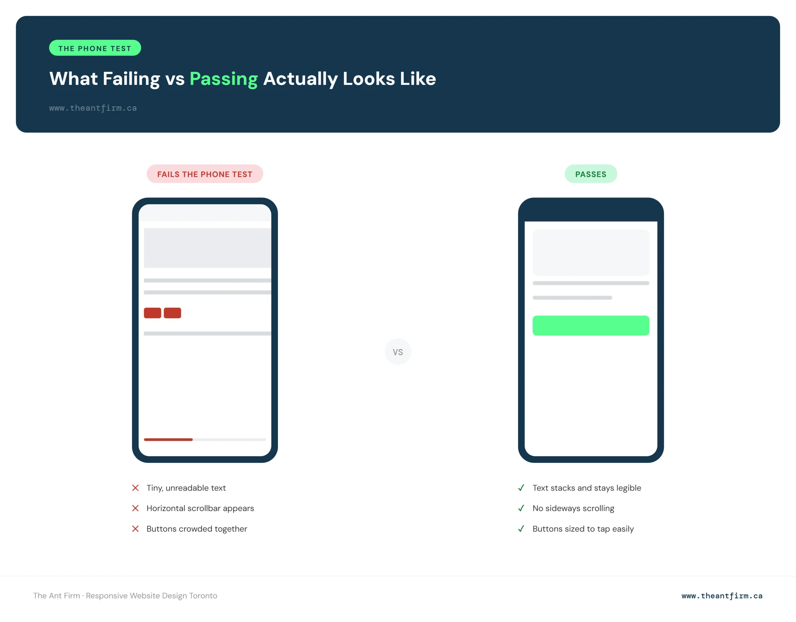
Here’s what failing looks like in practice:
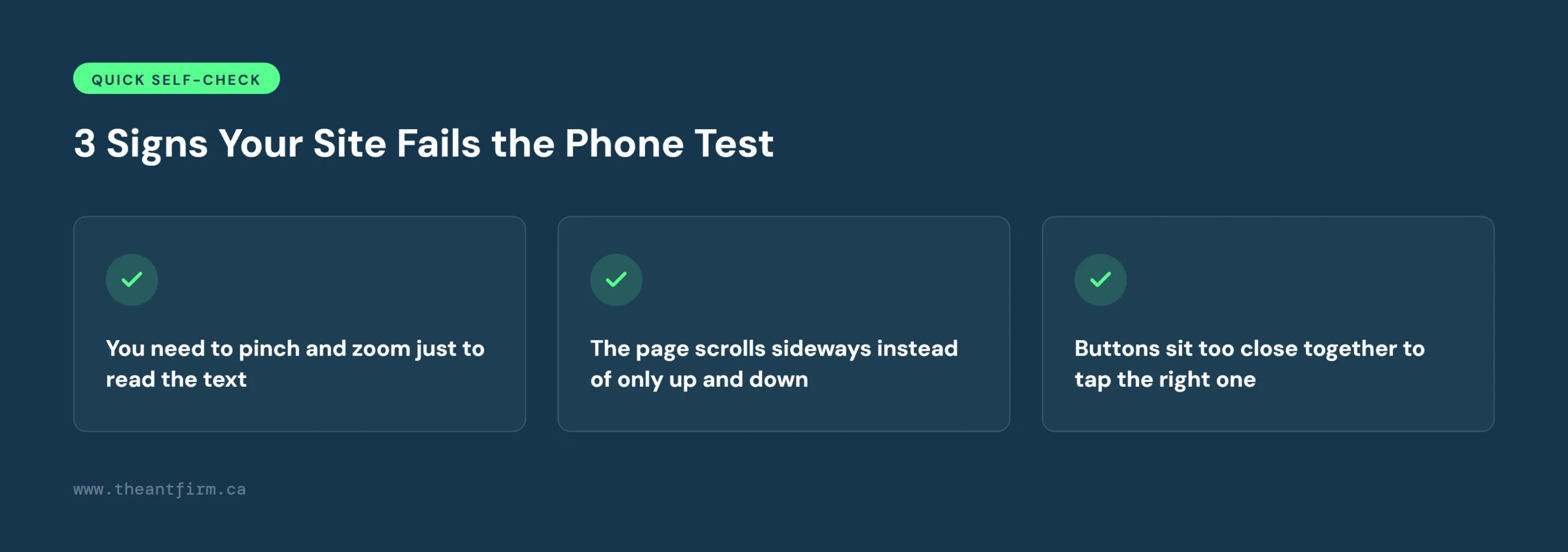
- You need to pinch and zoom just to read the text
- The page scrolls sideways instead of only up and down
- Buttons sit too close together to tap the right one
- A contact form cuts off part of a field or a button falls off the edge of the screen
- Images load slowly or spill outside the visible area
If any of that happens, your site isn’t responsive, no matter what your web guy told you three years ago.
Check Your Website on Different Screen Sizes
You can get a solid idea of how your website handles different screen sizes without paying for a testing tool or installing anything. Two free options are enough for a quick check, and they’re a useful starting point for reviewing responsive website design in Toronto.
Start with Am I Responsive. Head to fireship.dev/amiresponsive and enter your website address. The tool puts your site on a phone, tablet, laptop, and desktop in one view, so you can see how the layout holds up across different screens without opening each device separately. It’s a quick way to catch obvious problems: text that’s too small, images that feel cramped, or a button sitting awkwardly on a smaller screen.
Take a closer look with Screenfly. For a closer check, try Screenfly at quirktools.com/screenfly. It lets you view your website at specific device sizes one at a time, so you can check an iPhone, Android phone, tablet, or desktop and look at each layout more carefully. It takes a little longer, but that extra time can reveal problems that are easy to miss in a quick overview.
Both tools were checked directly against a live GTA business website, cleaningexpertstoronto.ca, before being named here. Together, they give you a simple way to see how your site looks and works across common screen sizes in around five minutes.
Skip Google’s Old Mobile Friendly Test
One thing to keep in mind: Google’s Mobile Friendly Test is no longer available. Google retired the tool and its API on December 1, 2023, a change confirmed by Search Engine Land.
So if you come across an older article telling you to run Google’s Mobile Friendly Test, don’t waste time looking for it. The tool has been retired.
What Happens When a Customer’s Phone Fails the Test
A homeowner in Scarborough needs a plumber and finds your website on Google. They open it on their phone, but the text is too small, the menu doesn’t work, and the phone number is hard to find. They leave and try another plumber.
The same thing can happen to a salon in North York. A customer starts booking an appointment, but the form doesn’t fit the screen and the submit button is hard to reach. They give up and book somewhere else.
These moments cost you calls, bookings, and enquiries you never even hear about. A responsive website design Toronto customers can use easily makes it much easier for them to take the next step instead of closing the tab.
Why Google Penalizes This Even When Customers Don’t Complain
Even when every visitor who lands on a broken mobile page just quietly leaves without saying anything, Google still notices.
That’s because of mobile-first indexing. According to Google’s own Search Central documentation, Google mostly crawls and ranks websites using the mobile version of the page, not the desktop version. Whatever content, links, and structure show up on your phone screen is what Google is actually judging.
That means a site can look completely fine on a desktop monitor in your office and still be quietly losing ranking, because the version Google is indexing is the cramped, broken one your customers see on their phones.
This is separate from the lost calls and bookings covered above. Even a business that never hears a single complaint about its mobile site can still be sliding down the results page because of it.
The Real Fix Isn’t a New Coat of Paint, It’s Structure
When a business owner notices problems on their mobile site, changing the theme can look like the easiest answer. A new design might make the website look fresher, but it doesn’t always fix what’s going wrong underneath.
The same issues can still show up after the redesign: buttons that are hard to tap, forms that run off the screen, pages that take too long to load on mobile data.
That’s because a theme mainly changes how a website looks. A proper mobile fix means looking at how the site is actually built, from the page layout and navigation to how content and images are handled.
The basics matter. Pages should be easy to move through with a thumb, buttons should be easy to tap, content should be clear, and important pages should load quickly on a phone. The Ant Firm treats this kind of structure as part of the SEO work itself, not a separate step. Changing colours, fonts, or templates can freshen up a website, but it can’t fix a weak structure on its own.
A quick phone check can tell you a lot about what customers actually experience on your website. You can do it yourself in a couple of minutes.
Open your website on your phone and check the main pages. Can you read the text without zooming? Does the menu open easily? Tap the buttons and try a contact or booking form, and make sure nothing is cut off or scrolling sideways.
If the site feels difficult to use, customers may leave too, and that’s the moment worth acting on. These checks are free, but fixing the problem for good usually means changes to the layout, navigation, forms, and page structure.
If your site needs a full rebuild, The Ant Firm’s web design service starts at $2,000 and focuses on making your website work well on the devices your customers actually use.
Frequently Asked Questions
Is my website mobile friendly?
Open it on your phone. If you can read the page, scroll, tap buttons, and use forms easily without extra effort, it’s mobile friendly.
How can I check if my website is responsive?
Open your site on different phones, tablets, and computers, or use a free tool like Am I Responsive or Screenfly. Check the text, menu, buttons, images, and forms on each.
Does mobile friendly design affect Google rankings?
Yes. Google mostly uses the mobile version of your website when crawling and indexing pages, so a mobile site that doesn’t work properly can affect your rankings even if the desktop version looks fine.
What if my website isn’t mobile friendly?
Fix the layout, buttons, forms, menu, and page speed first. If the problems go deeper than that, you may need to rebuild the site’s structure rather than just its design.
Your website doesn’t need to look perfect on every screen. It needs to work the moment a customer is ready to call, book, or ask for a quote.
Responsive website design Toronto isn’t a look, it’s whether your site holds up when someone opens it on their phone. Take a few minutes to run the phone test yourself and see what a real visitor experiences.
If the pages are hard to read, the buttons are difficult to tap, or the forms don’t work properly, it’s worth fixing. Getting it right means more of the people who find you on their phones can actually become customers.