Your website’s navigation menu is one of the most important elements for providing a positive user experience and encouraging conversions. An intuitive, easy-to-use menu allows visitors to quickly find what they need on your site. On the other hand, a confusing or cluttered navigation will drive visitors away. In this article, we’ll walk through the key principles and best practices for designing a website navigation menu that converts. As an experienced Toronto web design company we know what it takes to create menus that help, not hinder, your website visitors.
Keep the Menu Simple
One of the biggest mistakes we see is websites trying to cram too many pages and links into their main navigation menu. This creates a cluttered look that overwhelms users.
Instead, be selective about only including your most important pages in the main menu. These usually include:

- Home
- About
- Services
- Products
- Contact
Any secondary or tertiary pages can go in a dropdown sub-menu. Or consider using a footer navigation menu for extra links.
Keeping your main menu clean and straightforward helps visitors quickly find the main sections of your site.
Use Clear, Concise Link Labels
The text you use for each navigation link also impacts the menu’s usability. Avoid vague labels like “Page 1” or “Section 5.” Instead, use descriptive text that tells users exactly what page they’ll find when clicking a link.
Some best practices for navigation link labels:
- Use 2-3 words maximum for each link
- Use recognizable keywords related to the page’s content
- Be consistent with link styling and capitalization
- Place the most important links on the left
Pro tip: Do user testing to see if your labels make sense to visitors. If testers struggle to predict where a link will take them, rework the label for clarity.
Structure Your Menu Logic
Think about the logical structure of your site when arranging navigation menu items. Group related sections together and order them in a way that makes sense.
For most websites, arranging your menu with these principles works well:
- Begin with the “Home” link
- List main sections by importance
- Use dropdowns for secondary pages
- Put “Contact” link towards the end
Also try to maintain consistency as visitors navigate deeper into your site. Keep menu groupings and structure the same across all pages.
Make It Mobile-Friendly
With more site traffic coming from mobile devices, your navigation menu needs to adapt for smaller screens. The hamburger icon ☰ has become a standard mobile menu trigger. When clicked, it opens up a drop-down version of the main menu.
However, avoid hiding your menu behind the hamburger whenever possible. Studies show open mobile menus lead to higher engagement.
Here are a few mobile menu design tips:
- Position menu at top of screen for easy access
- Use large, touch-friendly links spaced apart
- Limit mobile menu to 6-8 main links
- Sub-menus should slide out on click
Testing your mobile navigation to ensure a seamless experience is key.
Also see: How can you create a responsive navigation menu that is both user-friendly and SEO-friendly?
Do you require web development services? We are a Toronto web design company that can assist you with this.

Allow Logical Menu Exploration
Your website navigation should follow a logical hierarchy that “makes sense” to visitors clicking through your menu.
Some best practices for enabling intuitive menu exploration:
- Start general, get more specific deeper in menu
- Communicate parent-child relationships
- Use breadcrumb trails to show page position
- Create clear pathways to important content
The goal is for users to grasp the overall structure and be able to dig down to deeper pages without getting lost. Test your IA with users to identify any confusing menu logic.
Use Visual Cues
Don’t rely solely on text for your navigation. Visual and interactive elements can further enhance menu usability. Some examples:
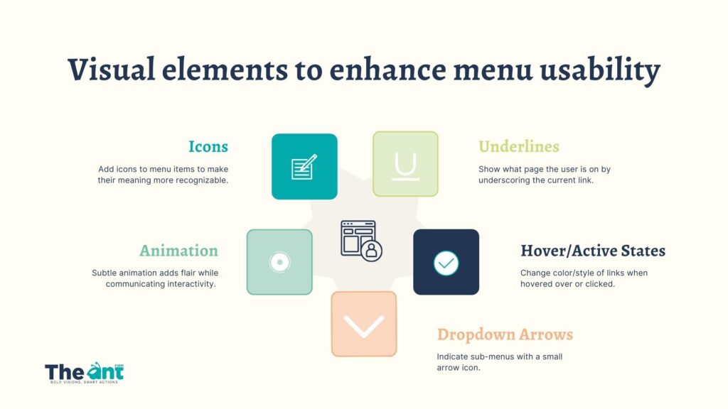
- Icons: Add icons to menu items to make their meaning more recognizable.
- Underlines: Show what page the user is on by underscoring the current link.
- Hover/Active States: Change color/style of links when hovered over or clicked.
- Dropdown Arrows: Indicate sub-menus with a small arrow icon.
- Animation: Subtle animation adds flair while communicating interactivity.
When styling your menu, make sure visual cues scale well and are noticeable on all device sizes. The cues should aid, not distract from, navigation.
Optimize Mega Menus
Mega menus have become popular, allowing sites to fit lots of navigation content in one sprawling menu. But beware—poorly designed mega menus harm more than help.
Follow these tips for usable mega menus:
- Logically group menu sections into columns
- Use whitespace and dividers between groups
- Label menu sections clearly
- Include search bar for easier navigation
- Follow a shallow hierarchy with max of two sublevels
- Don’t auto-expand groups on hover
With strategic design, mega menus can be an effective navigation option. But a minimal mobile-first approach tends to perform better overall.
Conduct UX Testing
Never assume your website navigation is intuitive without testing it. Conduct user experience testing to observe real people using your menu.
Some key things to test for:
- Success finding important pages
- Confusion over link labels
- Ease of finding the “Home” and “Contact” pages
- Getting lost when exploring sub-pages
- Ability to complete desired tasks
Address any issues that come up during testing to improve your menu. It’s normal to go through several iterations of testing and refinement.
Also See: Improve your Website’s UX with Navigation Testing

Partner with a Toronto Web Design Agency
As you can see, creating a user-friendly website navigation requires strategic design thinking. For businesses in Toronto, partnering with a professional web design company in Toronto like The Ant Firm is the easiest way to achieve menu success. Our skilled UX designers will craft custom navigation tailored to your brand and site goals.
Learn more about our web design services here